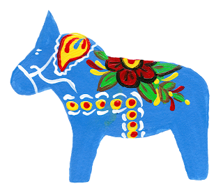
On this ornament in addition to the coma strokes I painted a few daisies to lighten and brighten up the design.
For the next one I used a darker red and a few other brushstrokes to change things up a bit.
I felt that this design got a bit too busy so I made the next red horse quite a bit more simple.
I'm hoping that this mixed media design will look great on products like greeting cards, wrapping paper and fabric. Depending on how those work out I may try it on other products too.
I added a border when I put it on a card and I liked it even better.
Here is how the new horses look with the rest of my collection.
I had just a few horses left and couldn't resist painting them up too.
This last picture is actually the green and yellow horses together shot with a different filter. somehow it turned them all the same shade of orange which offers even more possibilities.


